Associate Development Library
A facelift of Penske's internal learning platform home page and resource library, introducing a scrolling announcements feature and a streamlined real-time filtering system to improve navigation and content discoverability for employees.
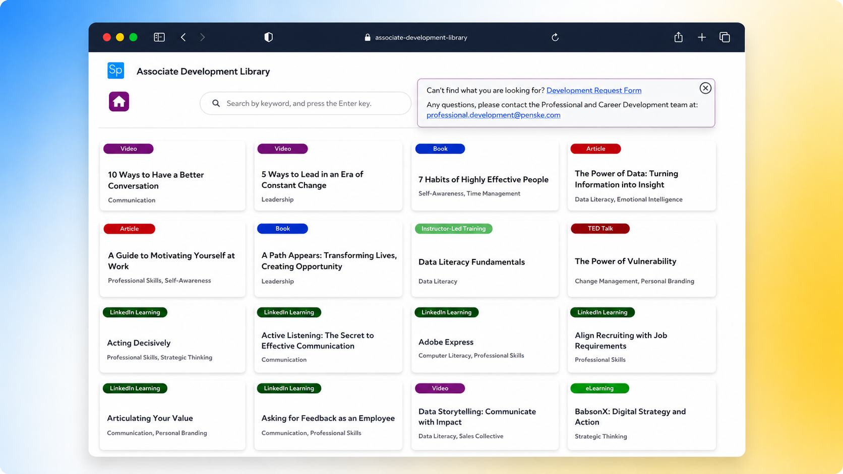
Overview
Company: Penske Logistics
Platform: Microsoft Power Apps
My Role: Lead & Sole UX Designer
Tools: Figma · Microsoft Teams · Power Apps
Timeline: 11 Weeks
Problem
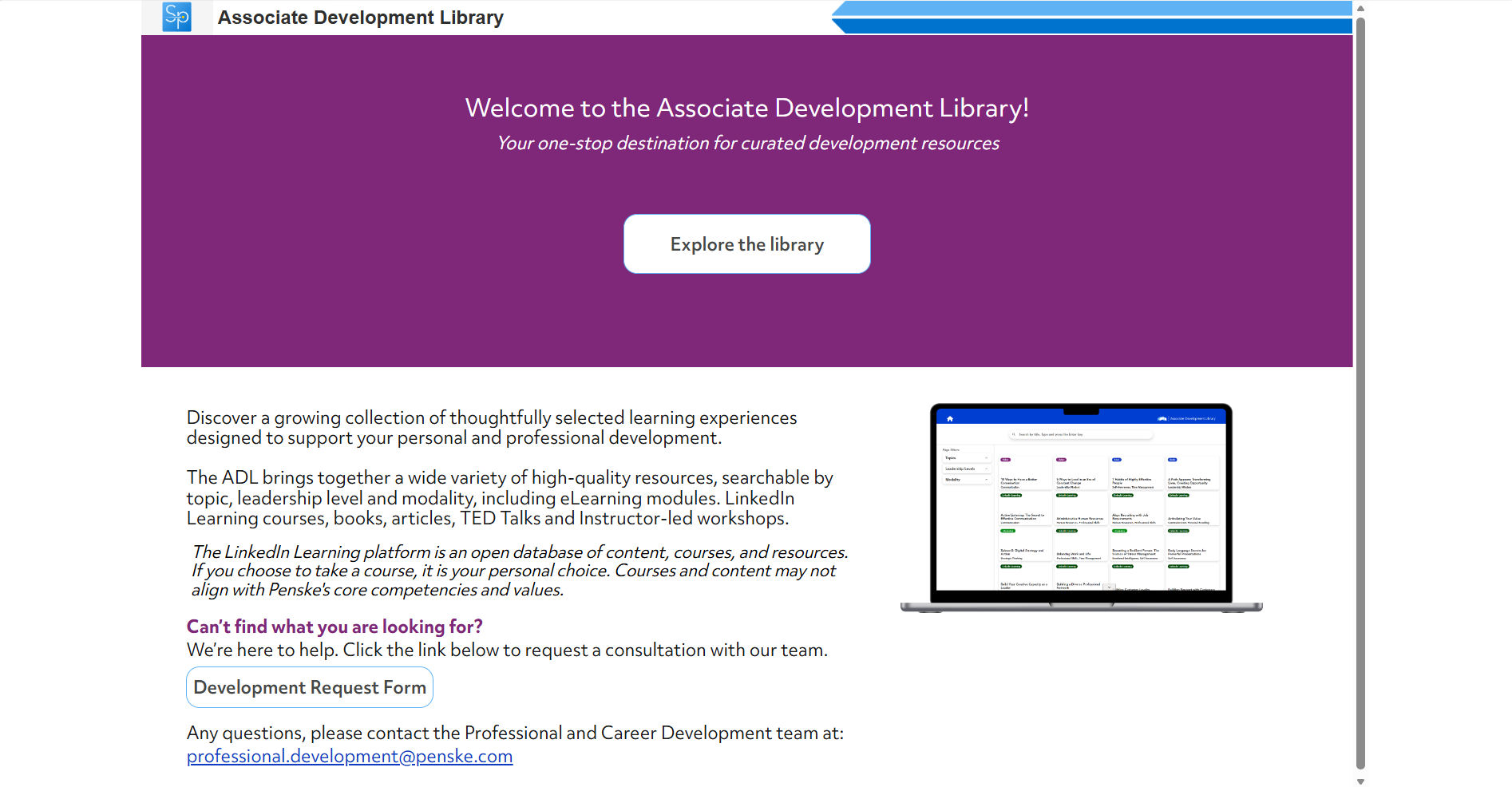
The Associate Development Library's home page and resource library felt dated and difficult to navigate, burying important updates and making it hard for employees to quickly find relevant learning resources.
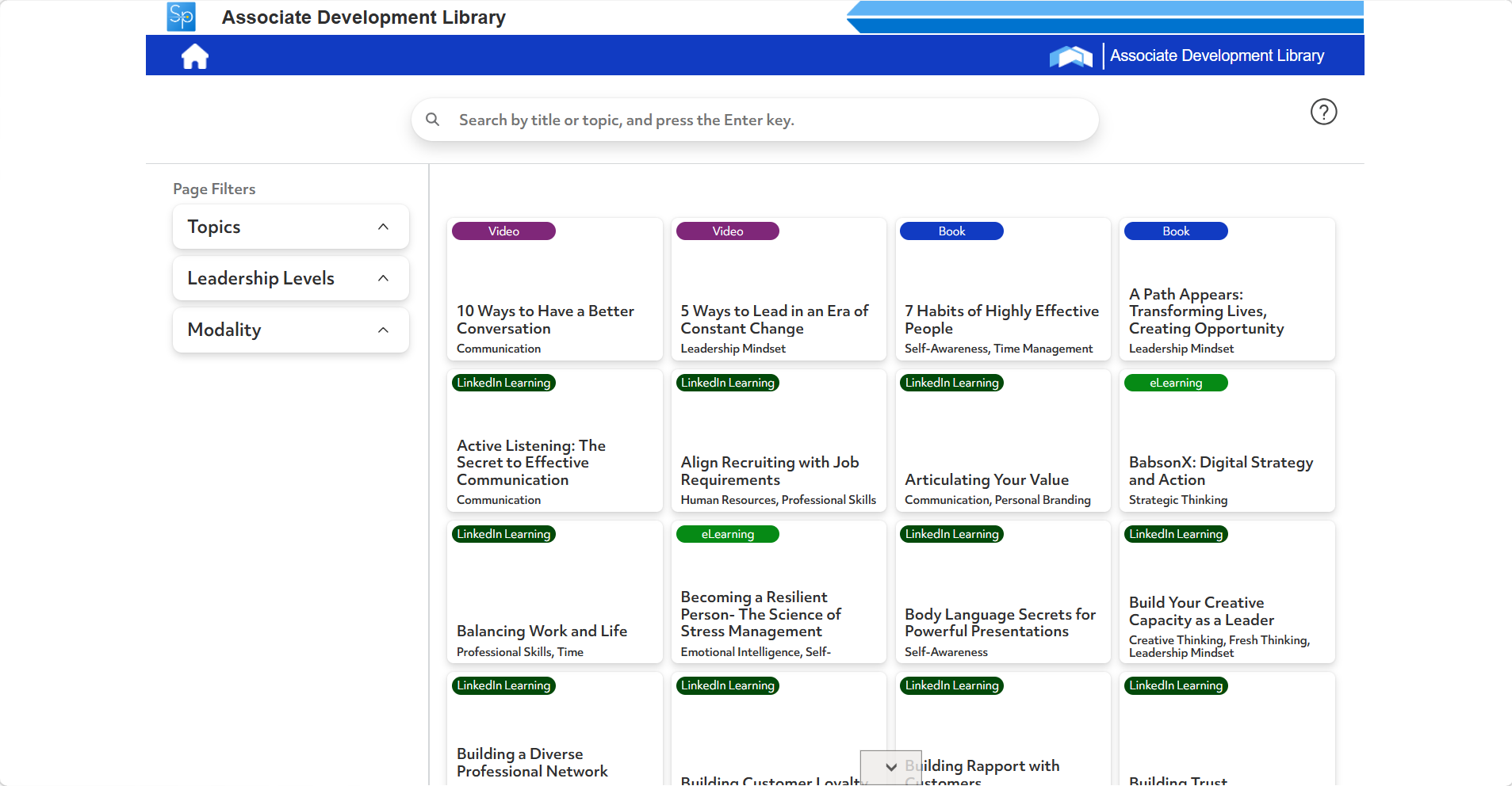
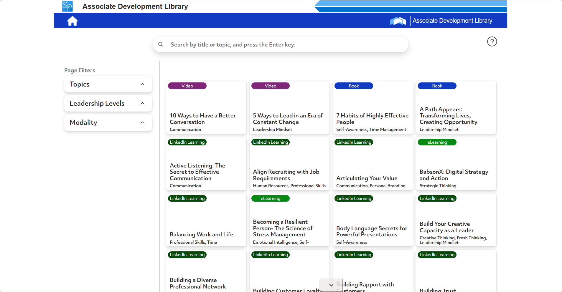
The core problem: The home page had no way to surface time sensitive announcements, and the resource library's left hand filter panel took up valuable space and slowed down how quickly users could narrow results.
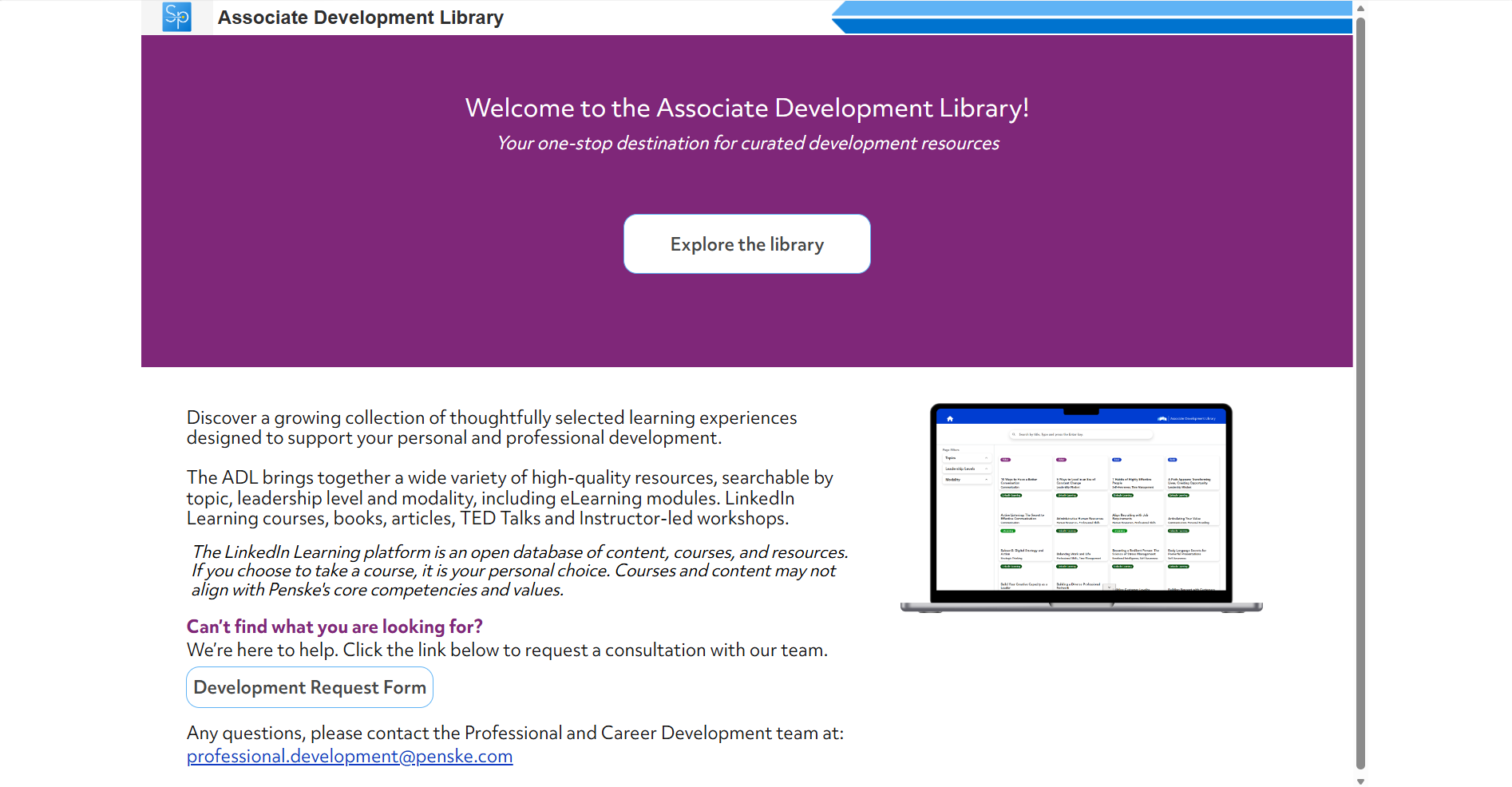
Fig. 1 — Original ADL home page (before)
Research & Discovery
Since direct access to end users wasn't possible, discovery centered on stakeholder collaboration.
Stakeholder Interviews I conducted observation sessions where the two Associate Development Learning team stakeholders clicked through the existing Power App design.
Developer Knowledge Transfer A separate, more technical walkthrough with the developer, who broke down the underlying information architecture, what each dropdown filtered, and the structure of resource cards, including titles, descriptions, and indicators for multiple language availability and paid versus free resources.
Key Insight:
From the stakeholder observation sessions:
The existing left side filter panel took up real estate without adding proportional value, competing with the resources themselves for screen space. There was no way to communicate time sensitive updates to employees, since announcements had nowhere to live on the home page. The visual identity didn't reflect the Penske brand, which affected how credible and official the tool felt to end users. Overall, navigation friction came less from missing features and more from how the existing layout buried and cluttered what was already there.
From the developer knowledge-transfer session:
Resource cards carried more underlying metadata than the UI surfaced, details like language availability and paid versus free status existed in the data but weren't visible to users at a glance, which became the basis for adding those signifiers directly to tiles later. The filtering logic was more flexible than the original three filter UI let on, opening the door to consolidating everything into one real-time, multi-select search experience instead of separate static filters. Understanding how the drop downs and card data connected gave the design team the technical grounding to know what was actually feasible to redesign within Power Apps' constraints.
Design Process
Brainstorming & Technical Alignment Early discussions with stakeholders and the developer focused on establishing what was technically feasible within Power Apps before committing to a direction. This included weighing the notification bell concept against placing announcements directly on the intro page, and confirming font sizing and design style conventions with the broader team to keep the redesign consistent with existing brand standards.
Information Architecture With the underlying data structure understood through the developer walkthrough, the team restructured how content was organized and surfaced. The three static filters and separate search bar were reimagined as a single, hierarchy segmented control, and resource card fields were reprioritized so the most scannable information, title, format, and topic, generated first.
Key Design Decisions:
Announcement Feature
The process began with an initial concept proposing Netflix-style carousel tiles that would open into a detail view, with the number of tiles and their display duration left adjustable, and an open question on imagery versus icons versus text alone. This became the foundation for the final design. Through ongoing stakeholder calls, the direction evolved to prioritize surfacing five to six announcements dynamically, styled as a row of scrolling cards in the hero section that are expandable on click, closeable, and deletable.
Home Page Iteration
Iterative feedback shaped nearly every element. The hero banner moved through several treatments, from a purple background with accessibility checked text contrast to the final photographed workspace image with white, higher-opacity text for legibility, alongside the actual Penske logo replacing a generic icon. The Explore Library button was repositioned multiple times, eventually centering below the hero text, and a new View Library button was added to the header for quick access. Text links like “can't find what you're looking for” were converted into buttons for visual consistency, icons were relocated to the new resource detail page, the search bar was removed from the homepage banner, and the laptop mockup graphic was updated to reflect the new library design.
Impact & Outcomes
Before & after: Home page
Original purple hero banner
Original left-side filter panel
Penske Logistics
Fig. 2 — Original library page with left-side filters (before)
Original library page with left-side filters (before)
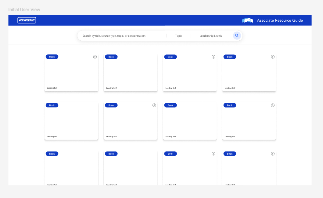
Fig. 4 — Early prototype of the initial user view / card grid concept
Library Page & Filter Redesign
The three left-side filters and top search bar were reworked into a single segmented, multi-select search bar covering search, topic, modality, and leadership level, filtering results in real time across nine content types, articles, books, eLearning, instructor-led training, LinkedIn Learning, skill practice, TED Talks, videos, and websites. The topic grid was narrowed from four columns to three for readability, purchase and LinkedIn Learning signifiers were added directly to tiles, and a LinkedIn language translation disclaimer was added to the page.
Key Design Decisions
Two decisions stand out from stakeholder collaboration: using a drop shadow and stroke instead of the requested purple fill to make the search bar stand out without introducing a heavy brand color, and converting two text hyperlinks into buttons for consistency with the Explore Library button. Clicking into any resource card now opens a dedicated detail page showing the title, topic, leadership level, mode, and full description.
No formal metrics were tracked; the redesign gave the Associate Development Library a modernized, cohesive visual identity that finally reflected the Penske brand. It introduced a way to surface time sensitive updates that hadn't existed before, and streamlined navigation by consolidating three filters into a single real-time, multiselect search experience. Resource cards grew larger and easier to scan, and the new resource detail page gave users a focused view of each item before committing to open it.

Fig. 7 — Final segmented search bar (search, topic, mode, leadership level)
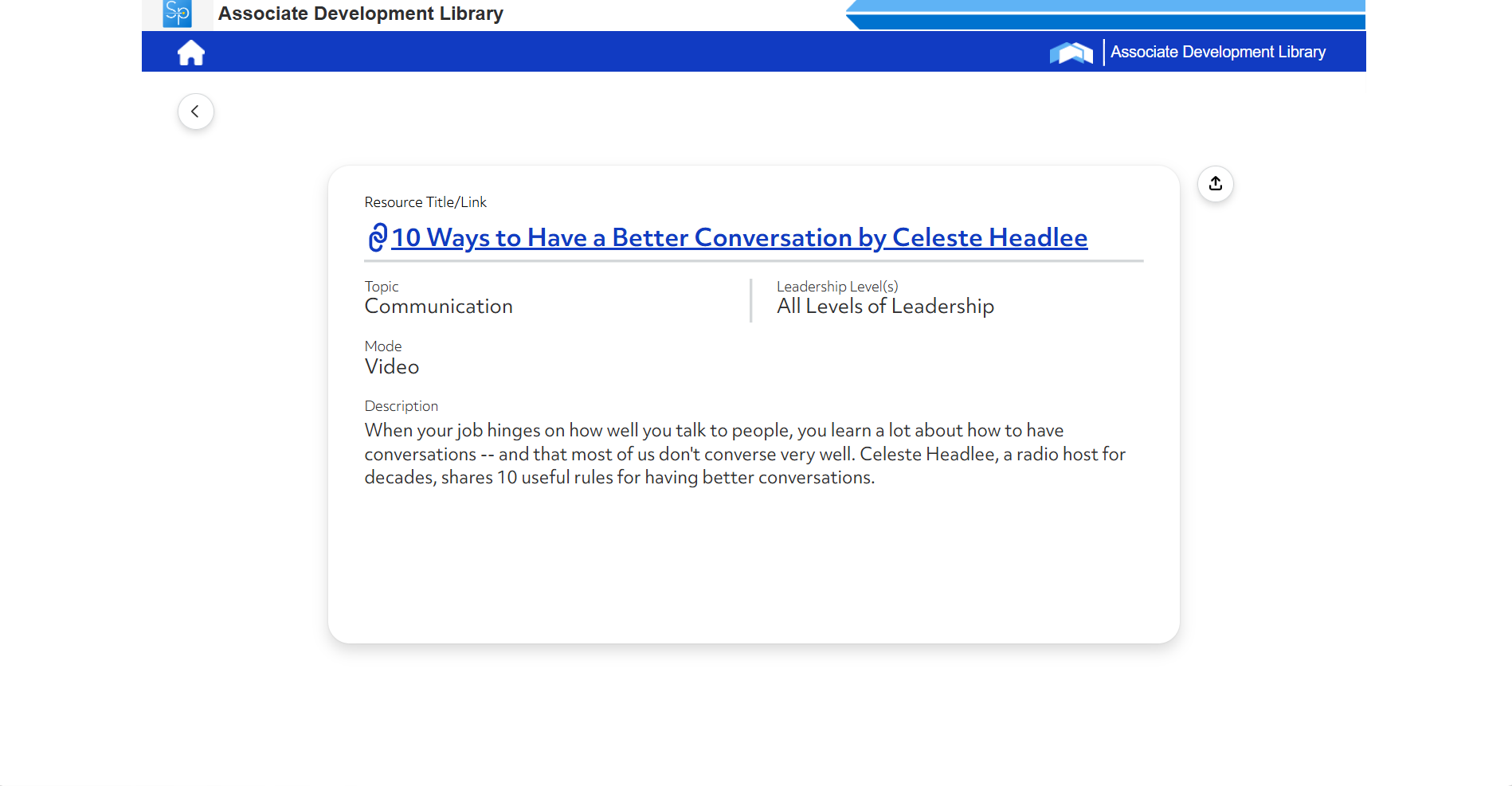
Fig. 8 — Final resource detail page
Before & after: Library
Reflection
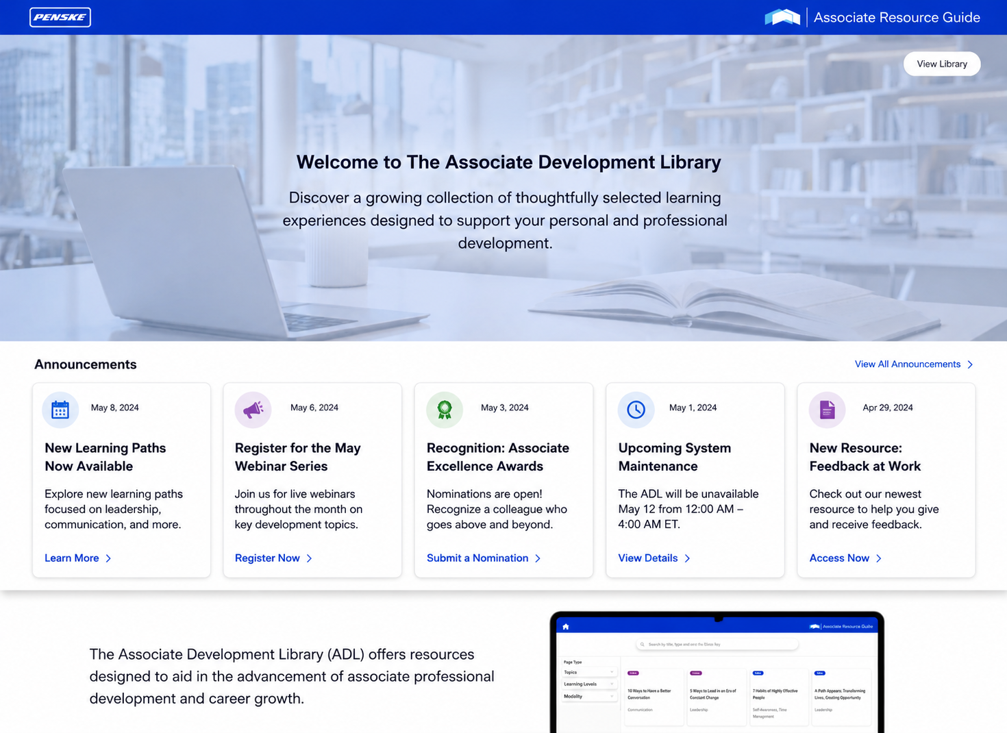
Updated branded hero banner with new announcement feature
Final branded hero prototype(Penske logo + photographed workspace)

Final segmented, multi-select search bar
This project reinforced the value of close stakeholder collaboration, especially when working within the constraints of an internal enterprise tool like Power Apps. That said, the biggest limitation was the lack of direct access to end users, all feedback came secondhand through stakeholders, meaning design decisions were validated against their expectations rather than real employee behavior. In future projects, pushing for even limited user testing would strengthen confidence that the design truly solves the problems employees face day to day.
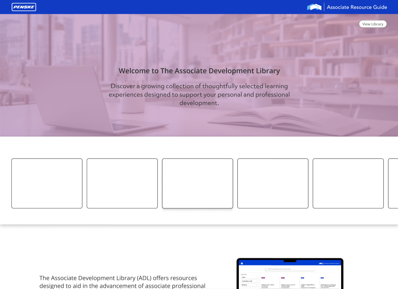
Fig. 3 — Prototype exploration of the branded hero and announcement placeholders
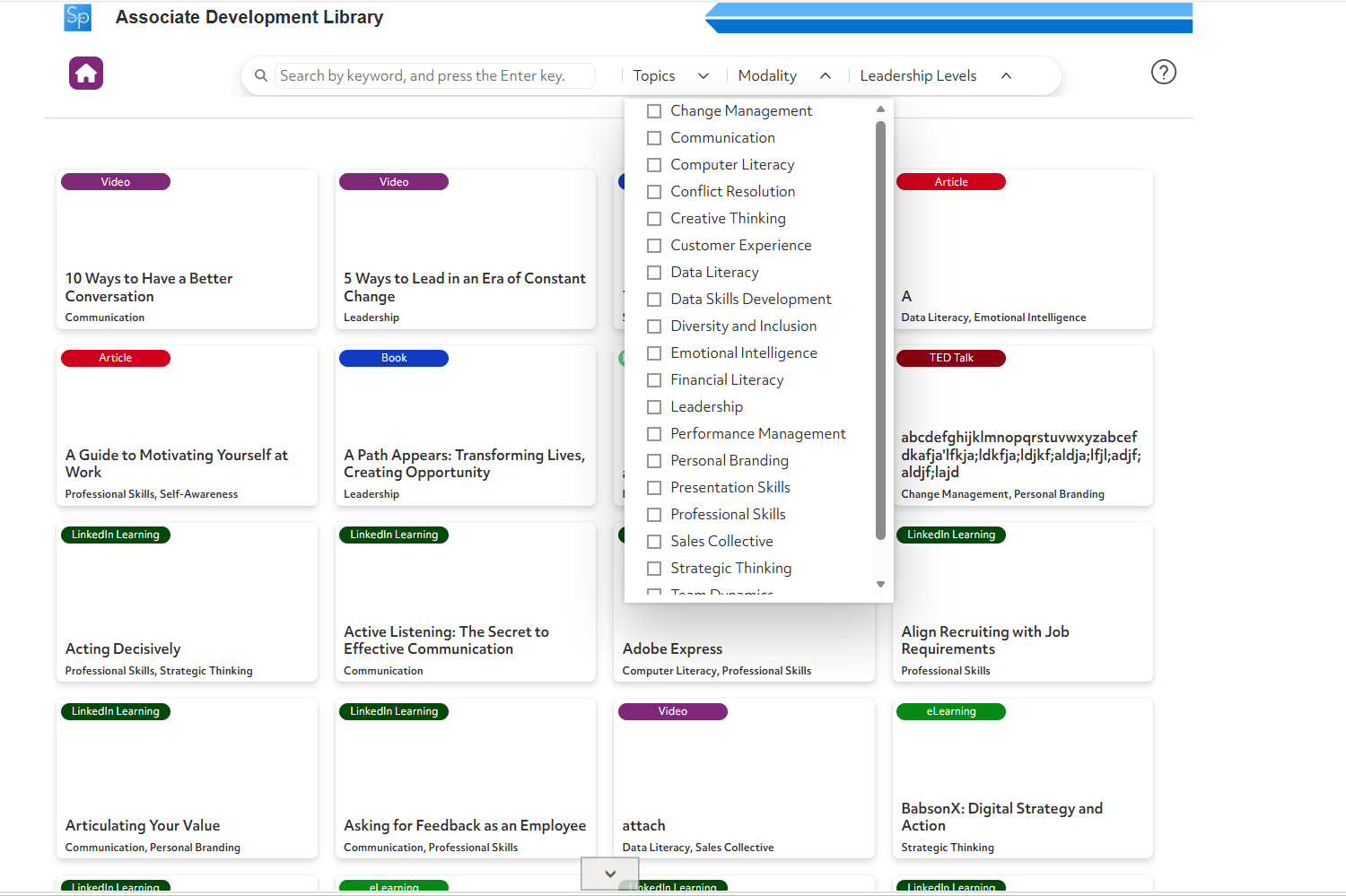
Fig. 5 — Topics filter expanded, multi-select checklist